I use a MacBook under duress. For a long time I variously used Windows and Ubuntu at work, but nearly all web developers these days seem to be using Macs, and being a holdout started to feel untenable, so I held my nose and made the switch.
Apple products are usually described as user-friendly. As a user, I disagree: Apple’s products are very user-hostile, unless you submit to doing things Apple’s way.
Some people are happy to do that. I’m not. Maybe it’s because I’m stubborn, or maybe I’ve just spent so long using PCs that I can’t adapt. Admittedly, some of my complaints are just things that I’m not used to, like window controls being on the left—not objectively better or worse than the alternative, just annoyingly contrary to muscle memory.
But I’m convinced that many of the problems with Apple products are objectively bad things.
This post is specifically about macOS, their desktop operating system. I haven’t really used any other Apple products, because I don’t like vendor lock-in and overpaying for things.
This post is also not about Apple as a company. To be clear, I think Apple is a terrible company: unethical, arrogant, and obnoxious; but that’s a post for another time, and probably better conveyed by someone smarter than me like Cory Doctorow.
I’ll also call out here that Windows also sucks in its own ways. The difference is that:
- I’m used to the ways Windows sucks
- Not many people are out there claiming that it’s good
(If you’re wondering what OS I’d consider to have a good interface, it’s Linux with KDE.)
Here, then, is my non-exhaustive list of things that suck about macOS.
Objective(ish) problems
(Obviously this is all ultimately subjective opinion, but some opinions are more subjective than others.)
General lack of customisability
This is the ur-problem from which a lot of the following problems flow. Many things in macOS can’t be changed, and other things require third-party software to change them, often with imperfect results.
A lot of these third-party addons cost money. Usually not a prohibitive amount—but it’s annoying to have to spend any money to fix things that should just work properly to begin with.
Good software takes into account everyone who will be using it. For an OS, that’s a lot of different kinds of people who have different preferences.
Bad window manager
Considering window management is one of the fundamental things a desktop environment needs to do, it’s remarkable how wrong Apple got this. The most obvious example is the lack of window snapping.
Any OS worth its salt has window snapping, where you can drag a window to the top of the screen to maximise it, or to the left or right edge to make it occupy half the screen, etc. Yet in macOS you have to install third-party software to add this feature (Rectangle being a popular choice). Rectangle does have a free version, but you need to fork out A$14.21 if you want all the features.
(Since I began writing this, I started using the latest version of macOS, Tahoe, which supposedly does have snapping. But to use it, you have to enable “Displays have separate spaces”. I do not want my displays to have separate spaces. Why should I need displays to have separate spaces for window snapping to work?)
Another issue is the way macOS handles maximising windows. When you maximise a window, all it does is resize the window to the size of the screen (minus the menu bar and dock). Contrast this with Windows or most Linux desktop environments, where “maximised” is a distinct state; the window will remember its un-maximised size, and if you un-maximise it then it goes back to that size.
Why does this matter? Because if you want to switch between having a window maximised vs. having it visible alongside other windows, it’s pretty annoying to have to manually resize it back to a smaller size. On Windows/Linux you just start dragging the window by its title bar, and it switches to its un-maximised state and its associated size. It might sound like nitpicking, but it matters to me when I’m juggling many windows.
Scrolling acceleration
I have to assume Apple either don’t test their products with other brands’ mice, or they deliberately make non-Apple mice work poorly on a Mac so people will accept Apple’s terrible “Magic Mouse” as the lesser of two evils.
(Yes, that’s the same Magic Mouse that has its charging port on the bottom, so you can’t use it while it’s charging, and is also an ergonomic war-crime. Why? Because Apple just likes to fuck with people who are in too deep to leave the ecosystem, I guess.)
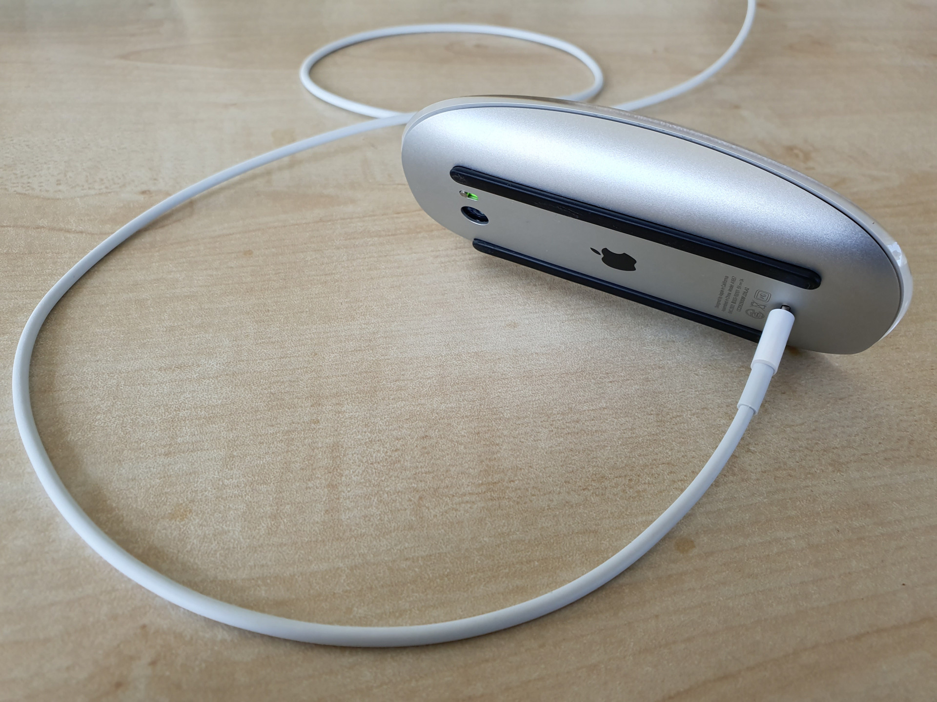
By default, if you’re using a good mouse (like the Logitech MX Master series), scrolling in macOS is miserable due to “scroll acceleration”. What this means is that the scrolling starts off far too slow, and then when you start scrolling a bit faster, the scroll suddenly becomes much too fast. There is no way to scroll at a normal speed, or to predict how far a turn of the scroll wheel will take you.
The correct way for a scroll wheel to work is linearly: one click of the wheel scrolls by a fixed amount. You know, like how it does on every other operating system.
Again, this requires third-party software to fix, my pick being BetterMouse (US$7.99).
No clipboard history
On Windows, if you press Win+V instead of Ctrl+V to paste, it brings up a clipboard history: a list of things you’ve copied, from which you can choose what to paste. KDE also has this, and probably most if not all other Linux desktop environments.
macOS doesn’t, of course.
The fix? You guessed it. Third-party software, specifically Raycast. Raycast does loads of other stuff too, but clipboard history is the big one for me.
App icons in the menu bar just disappear when there’s not enough room
Some apps show an icon on the right side of the menu bar. In some cases that’s the only way to interact with the app. But when there’s not enough room, such as any time my laptop’s not connected to a large monitor, some of the icons just… aren’t shown. So now I just can’t interact with those apps.

You’d think there would be an overflow menu, like with the Windows system tray. But no. Why? Because Apple doesn’t care about its users or their needs.
From my googling, there seems to be no good solution for this, aside from switching to a better operating system.
Screenshot filenames are badly formatted
There’s a trick employed by most software that generates timestamped files, which is to include the date and time in the filename in ISO 8601 format or some variant of it. So for a screenshot taken on the 4th of May 2026 at 6:48pm, you’d have something like Screenshot 2026-05-04 18:48:14.png.
This has the handy property that sorting the files by filename will also sort them chronologically. It relies on the fact that:
- The numbers strictly descend from the largest time unit (the year) to the smallest (seconds, or perhaps milliseconds)
- The numbers have leading zeroes as needed
- It uses 24-hour time
So of course, Apple in all their wisdom format screenshot filenames like this:
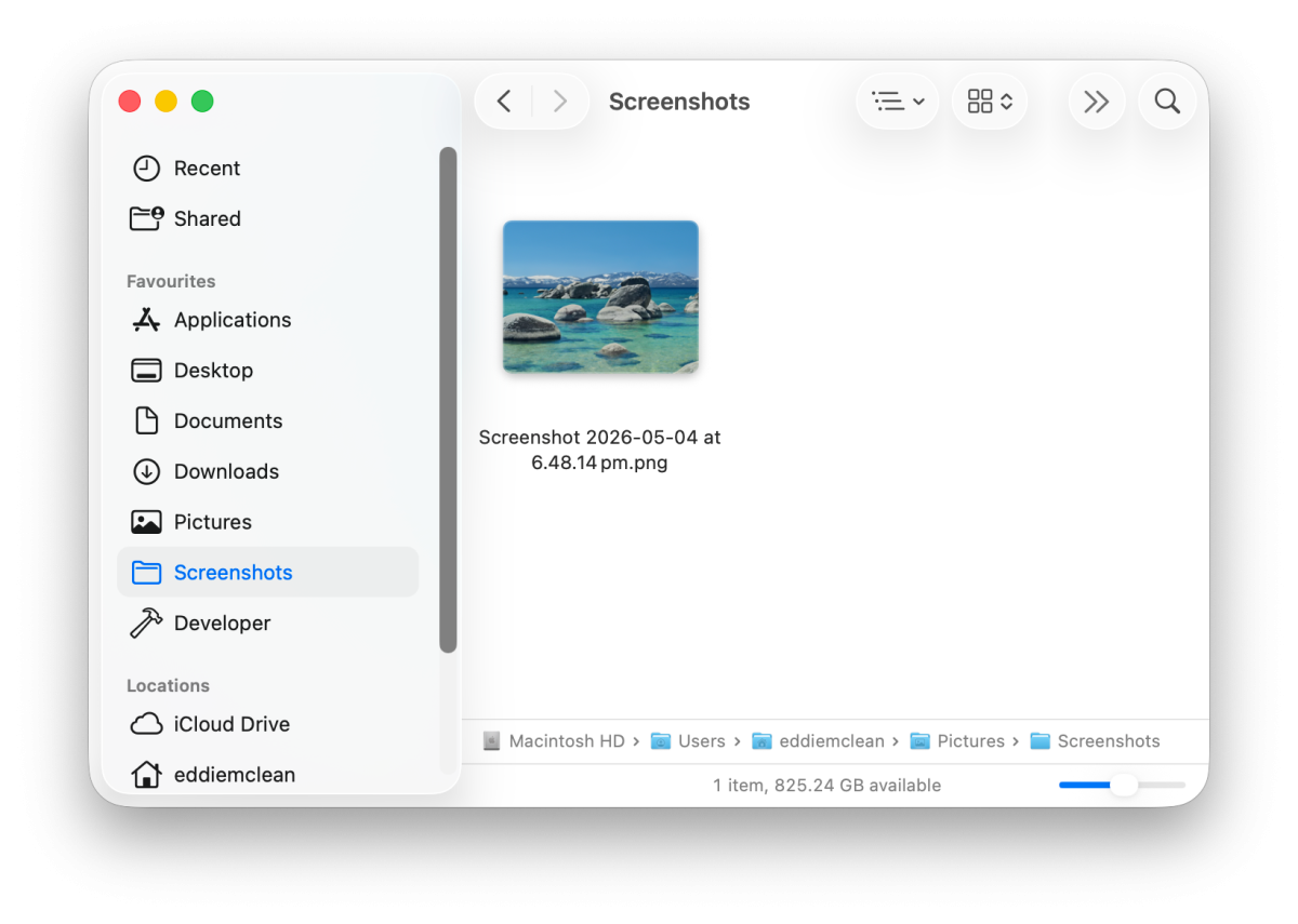
They got the date format right, but flubbed the time—that’s 12-hour time, so a file taken at 9am will sort after this one, even though it was taken before, because 9 is more than 6.
This is maddening not just because it makes it harder to find any screenshots I take in the afternoon, but because it would be so incredibly easy to fix.
I initially tried to work around this by using Automator to rename the screenshots as soon as they appear. For any file added to the screenshots folder, it would parse the time in the filename and reformat it. That worked, but it became irrelevant when I started using Shottr for screenshots instead. (Shottr has its own strange way of keeping the filenames chronological, where the time is encoded using four letters. Not sure why they did that, but it works, I guess.)
Subjective(ish) problems
These ones are a bit more arguable than the ones above, but I think there’s still a pretty strong case beyond just personal preference.
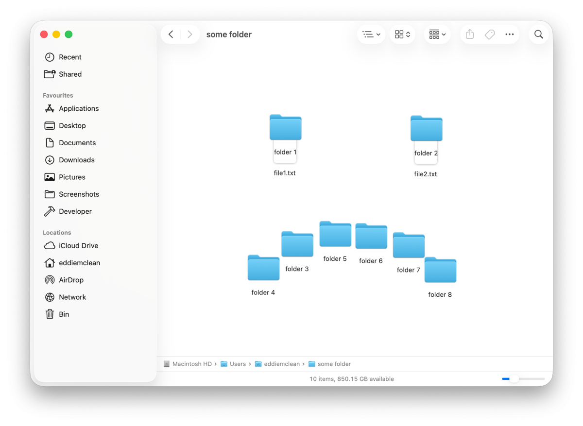
Finder has terrible defaults
The macOS file explorer Finder is, to be fair, reasonably configurable. But the default settings make no sense:
- The current directory path isn’t visible.
- File extensions aren’t shown.
- File/folder icons don’t sort by name or align to a grid. You can just drag them wherever.
One last gripe, something that isn’t configurable: Although you can copy and paste files in Finder, you can’t cut and paste. Why? Because Apple.
The dock
Can we all just admit that the dock is bad? Come on. You know it’s true, just admit it.
OK, I’ll elaborate. A key principle in interaction design is visibility of system status. And a prominent status for a desktop environment is “what windows are currently open?”. It’s important to me that this is visible at all times.
The taskbar in Windows or KDE shows exactly this: a tile for each window, its icon and title, and whether it’s currently minimised. You can bring up the window you need with a single click. Microsoft, for all their faults, nailed this three decades ago.
And hey, it’s not like I think all the aspects of the desktop were perfected by Windows 95. Only most of them. I mean, I never figured out what “My Briefcase” was meant to be.

The macOS dock, meanwhile, tells you bugger-all about what’s open. Yes, you can see which applications are open, but not the windows. If you want to see those, you have to bring up Mission Control.
(Don’t get me started on the cutesy names Apple insists on choosing for stuff like this. “Mission Control”? I’m doing web dev, not launching a space shuttle.)
Mission Control shows you a full view of every open window in a big random jumbled mess. It works fine if you’ve only got a few windows open. But when you’ve got several browser windows, half a dozen dev tools windows, VSCode, the terminal, several Finder windows, Workflowy, YouTube Music, and Figma? The overhead of finding the window I need each time is untenable.
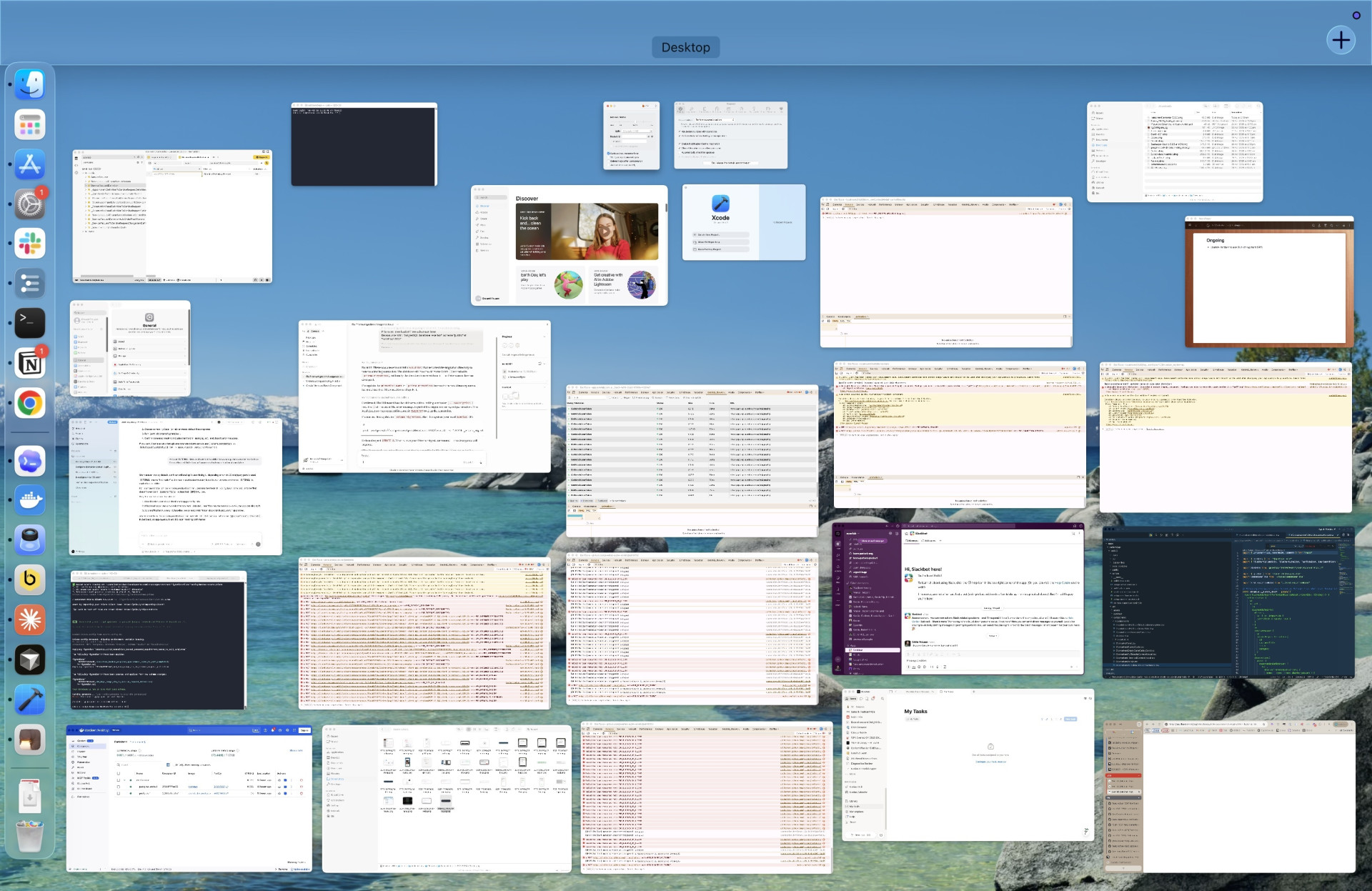
On a taskbar, meanwhile it’s easy, at least for me. My working memory is very positional: I remember where each window sits on the taskbar, and can switch back to it with no effort.
macOS can be blessed with a taskbar using this app. It’s not a perfectly smooth experience, but it’s good enough.
First click in a window only focuses
This is a weird one. In macOS if you click in a window that’s not already focused, all it does is focus the window. Even if you clicked directly on a button, it won’t register as a button click.
This is strange and unnecessary. In Windows or Linux, you can click something directly in a window that’s not focused, and it will register the click as well as focusing that window. It’s efficient. There’s no reason to require an extra click there.
The only theoretical downside of the Windows/Linux approach is that you might want to focus a window without clicking anything. But this is a non-issue: normally in any app there will be some non-interactive area you can click, and failing that you can click the window’s title bar or its entry in the taskbar. In decades of PC use this has never been a problem for me.
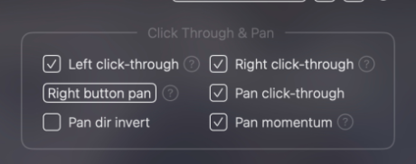
BetterMouse comes to the rescue again on this one, with its click-through options.
Can’t create files via right-click menu
In Windows/Linux you can right click in a folder and there’s a “Create file” option. It’s mainly just for text files, but it’s handy. In macOS you can create a folder that way, but not a file.
There are third-party fixes for this too, but I haven’t tried any yet, because I’m just so tired. Why do I have to keep downloading apps to prop up this garbage OS? Why??
Can’t delete files with the delete key
I mean, come on. The key literally says “Delete”. Why are you doing this, Apple?
Purely subjective
These don’t make any more or less sense than the PC way, but at this point I’m so fired up I’ll rant about them anyway.
Window buttons on the left
Not much to say here… they’re on the left. I want them to be on the right. It should be configurable.
Different modifier keys
This honestly just feels contrarian to me.
App menus in the OS menu bar
In Windows/Linux, apps have their menus in the app window, where they belong.
In macOS, app menus are shown in the menu bar at the top of the screen, alongside OS-level elements like the Apple menu and the clock. This confuses the hierarchy between OS and software, which strikes me as bad design. It’s a bit like if websites could insert their navigation menus into the browser toolbar.
Wait, that’s actually an interesting idea. I dunno, I’ve got to think about this one…
The positives
In the interest of fairness, here are some things I do like about macOS:
- It’s stable
- It’s UNIX-like
- There are some nice visual flourishes
- Trackpad gestures work well
- Automator is pretty cool
Conclusion
macOS is bad, and Apple should feel bad. ◼